Wanderlust: Museum of Travel is a fictional museum that features a vast collection of souvenirs and trinkets from all around the globe.
Seeking to revamp their visual identity and cater to a wider audience, this rebrand utilizes elements of the previous branding with a modern flair. Delivering to the client’s needs, I created a brand kit that speaks upon a refreshed visual identity through a new logo design, print assets, directional signage, web and app design, merchandise, and packaging. The rebrand brought about positive results where, in a collective of over 35 young adults, all of them found the new brand identity to be more engaging and appealing to their age group.

Project Details
-
One letter size booklet (8.5"x5.5" folded) booklet with 15 spreads, featuring over 60 photographs, 3 recipes, cohesive branding, and expressive writing.
-
This project began with studying a collection cookbooks currently on the market, taking notes on design and format. The beginning stages also included extensive project management — compiling recipes, researching Filipino history, and planning a production calendar.
My plan was to take a variety images that featured intentional staging, detailed close ups, and thorough documentation. A color palette was selected from the fully processed images, ensuring a cohesive color story throughout the design.
The photography, color palette, illustrations, layout, and writing all integrate and gain inspiration from one another, resulting in a polished an unified product that tells a story.
-
Victoria Cruz Almario, Recipes
Michael Tarui, Editor
Emmie Santiaguel, Editor
Boomerang Print, Publications
HeyZine!, Interactive Digital Publications
Art Direction
-
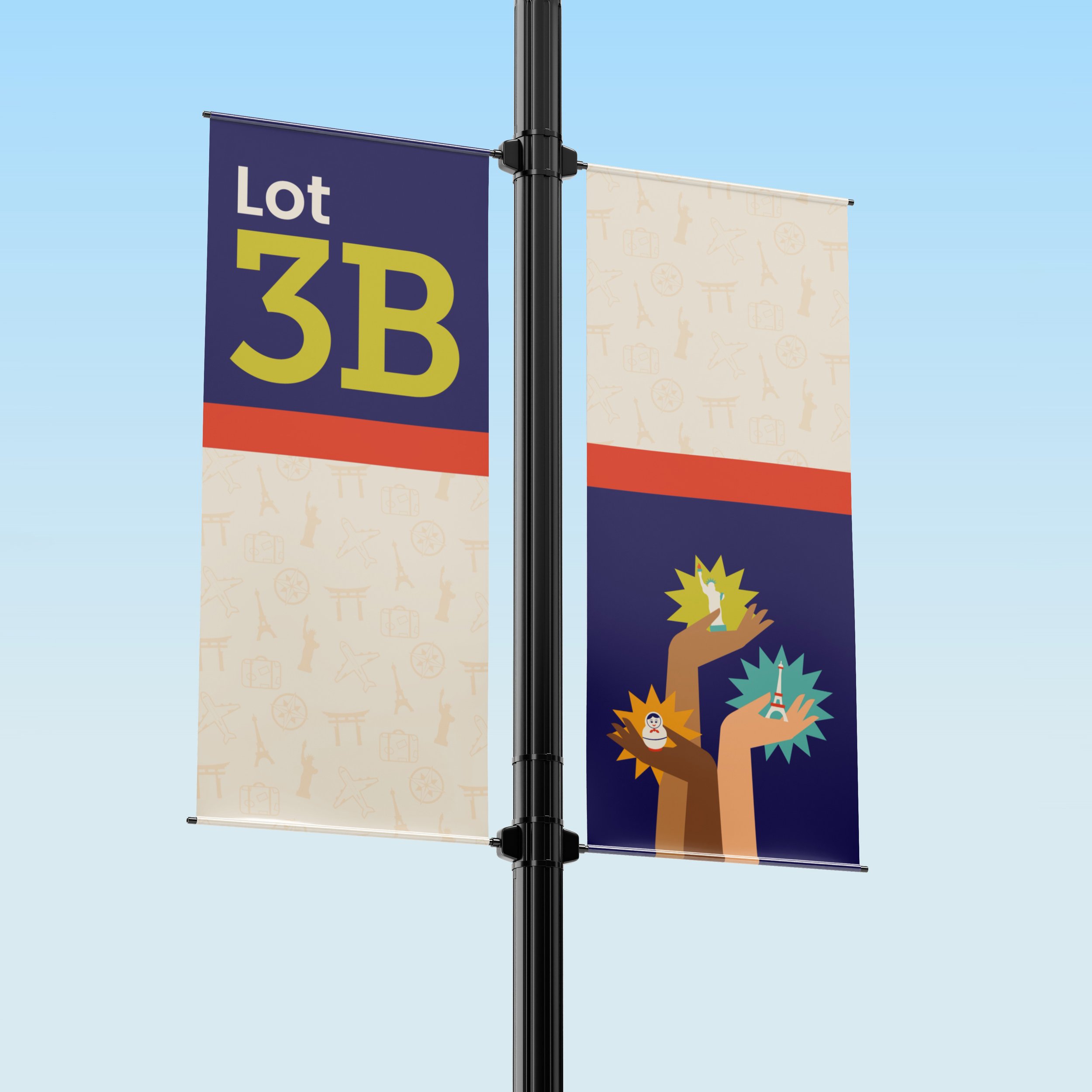
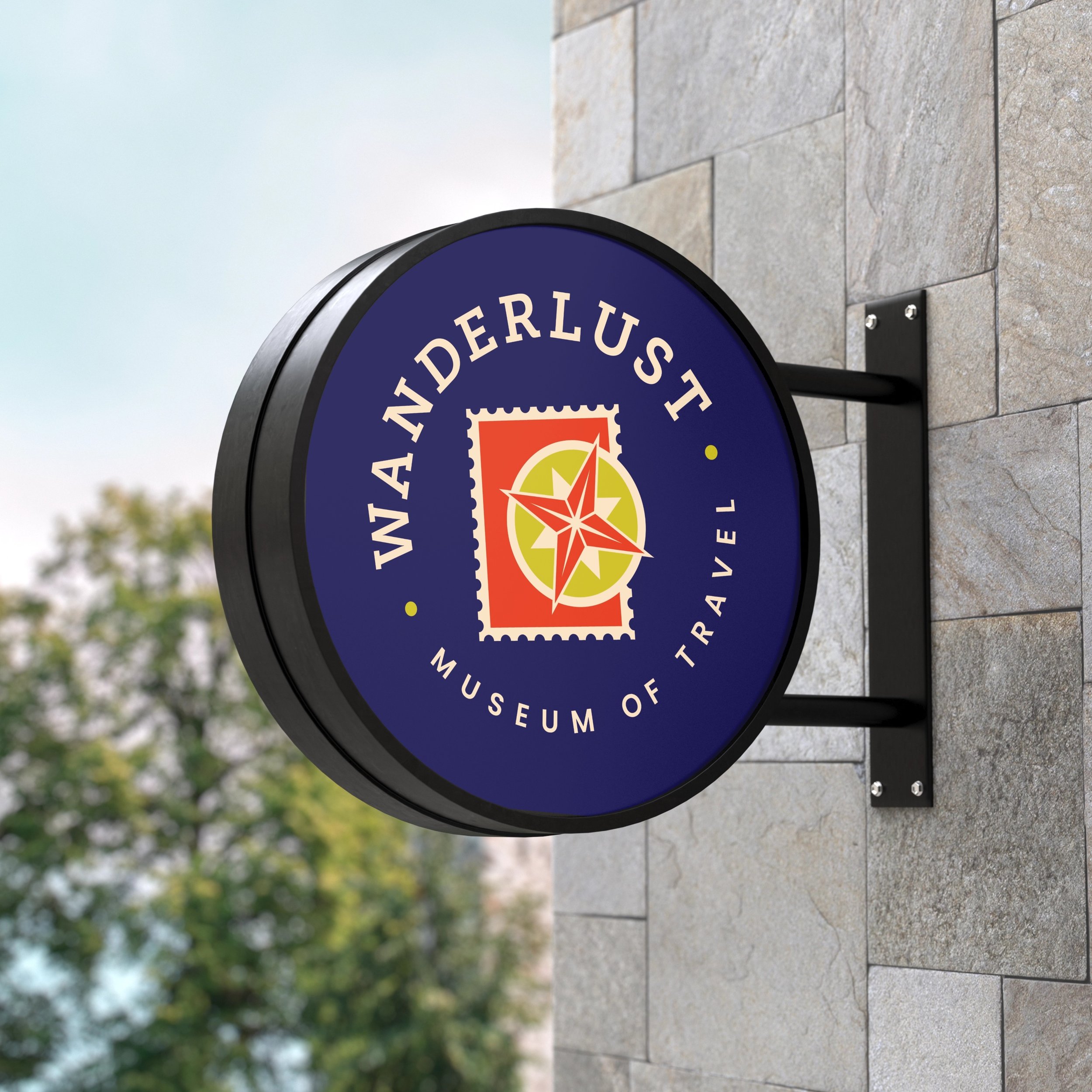
Originally titled “Wanderlust: Museum of Tchotchkes,” the museum’s art-deco inspired branding focused primarily on the objects in the collection. By changing the title to “Museum of Travel,” the new branding reflects the essence and mission of the museum. The rebrand features elements of the old branding, such as the hands holding the souvenirs and the icons of their original logo, but presents them with a fresh and contemporary visual identity.
-
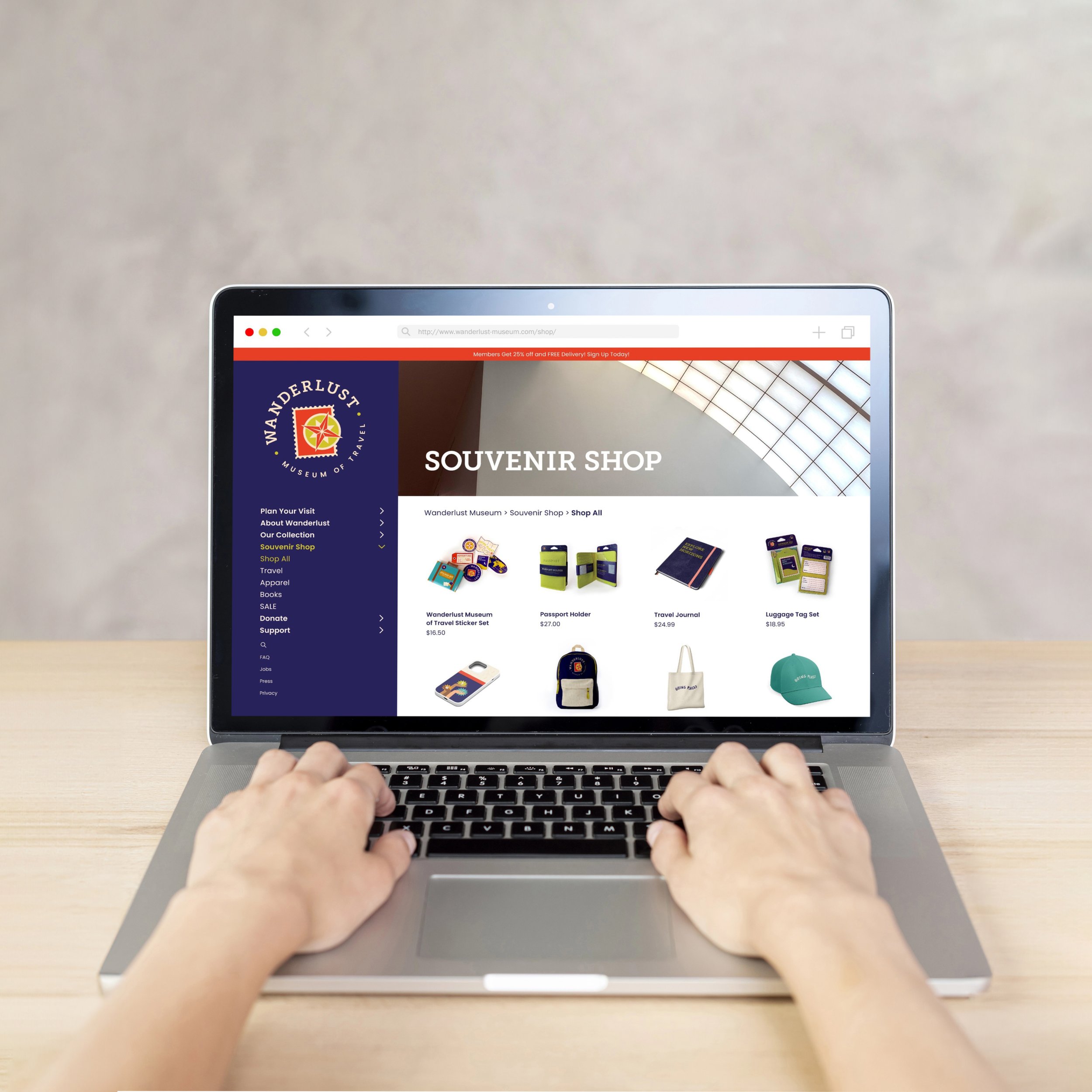
The museum’s new branding features an expanded color palette that incorporates vibrant and youthful tones of green, orange, and teal. These colors work together with the new star shaped elements to create a style that communicates a more energetic tone, appealing to a broader audience. This visual language is carried out throughout every aspect of branding in print and on digital platforms.
-
Building upon this playful tone, Wanderlust uses visual cues that reference travel to create a cohesive and immersive environment that evokes a spirit of adventure. Entry tickets are modeled after airplane boarding passes while posters are designed to look like oversized postcards. The museum brochures mimic US passports when closed, but unfold to reveal a world map highlighting different souvenirs in the collection and where they are from. These references are even extended into the museum merchandise, namely the sticker pack that is packaged as a mini vintage suitcase.